Situation
The Holonis icon set was not communicating the entreprenurial spirit, and character around the brand. Users were getting Holonis confused with Instagram. Additionally, the icons appeared dated.
Task
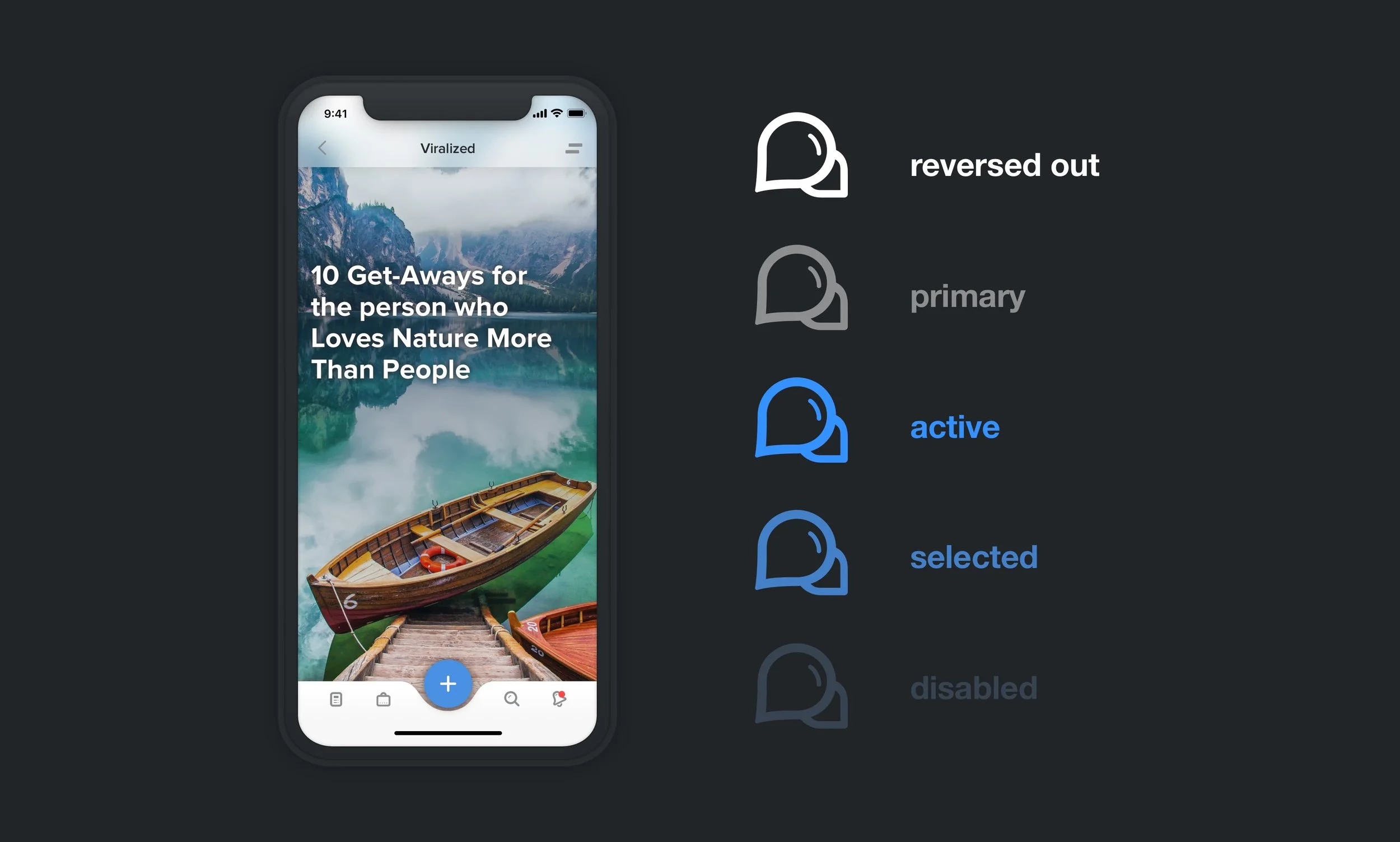
Create a new icon set that reflects creativity, humanity, aspiration while complimenting the Holonis brand. Swapping the icons will elevate the Holonis brand throughout the platform without a major re-design.
Action
Research yields that Holonis could use a softer more personal tone within it's icon set. According to feedback, the icons needed to stand out more, be easier to tap, be recognizable and go with the current brand message.
Results
Until a major re-design occures, the new icons will be differentiate Holonis from other social networks. The brand has elevated itself as a unique to users do to the minimalistic, and yet soft feeling of the icons.
Detailed Snapshots